Overhauling Blue Nile’s e-commerce catalog filters resulting in a 25% decrease in bounce rate and an 80% decrease in user-error rates.
Identifying the user's pain points
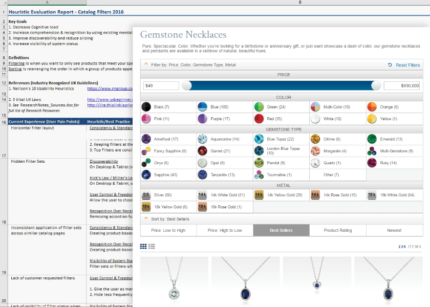
› Outdated catalog filters harmed discoverability
› Outdated catalog filters harmed discoverability
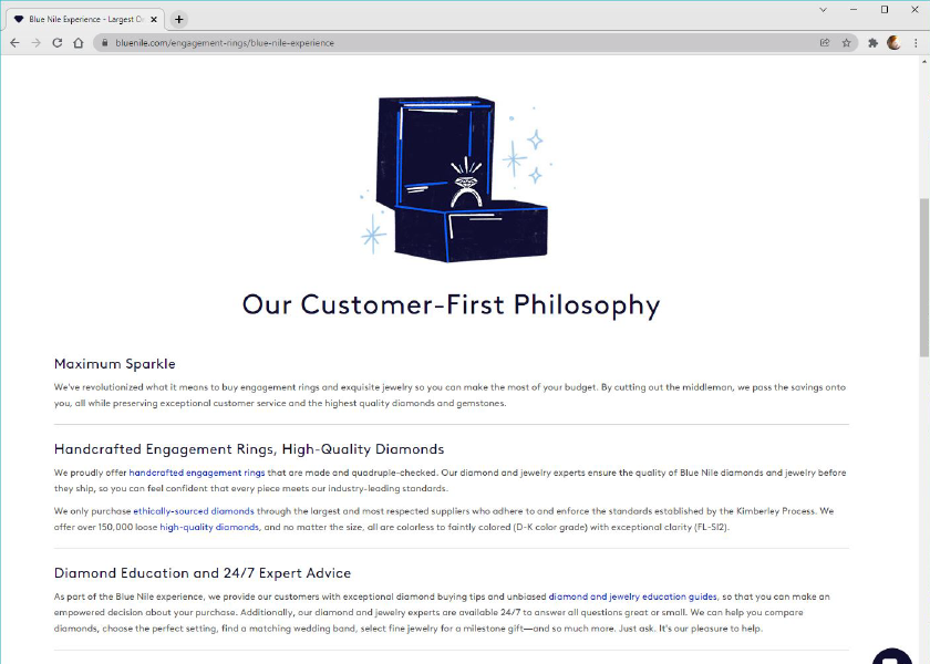
Blue Nile was an early innovator in the e-commerce space introducing the first customer-centric online buying model for diamonds, engagement rings, and jewelry.
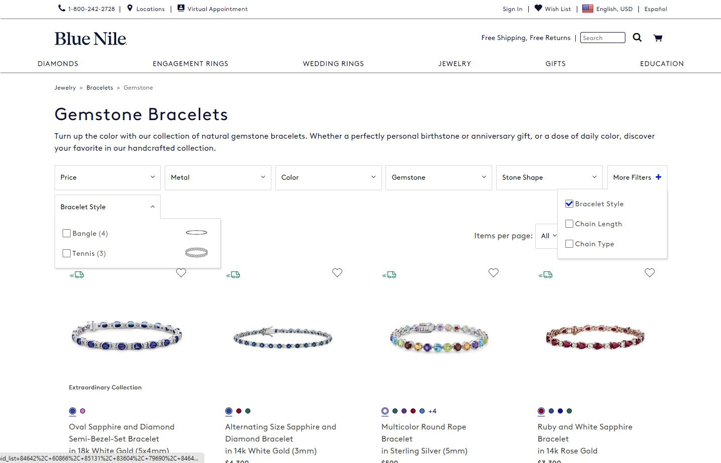
For any company selling a product online, discoverability is key—and data showed our users were struggling with discoverability and increased cognitive load. Our outdated catalog system suffered from bloat, tech-debt, and poor usability. An analysis of user data revealed that our product sorting and filtering systems were negatively impacting bounce rates and the overall user experience.
The Business Opportunity
› Better discoverability could lead to more sales
› Better discoverability could lead to more sales
Updating our product filters was an opportunity for Blue Nile to again demonstrate our dedication to our customers by making it faster and easier for our users to find what they were looking for. This would also benefit our brand by creating significant improvements in click-through rates, conversions, and brand loyalty.
MY ROLE
As a UX Designer, working under my CX manager, I led the effort to research, perform user testing, and design the new filtering system with the input of our in-house design team.
Continuing the Research
In addition to high bounce rates and poor discoverability, research revealed redundant catalog pages, missing filter sets, filter count errors, and an unexpected human-error use case.
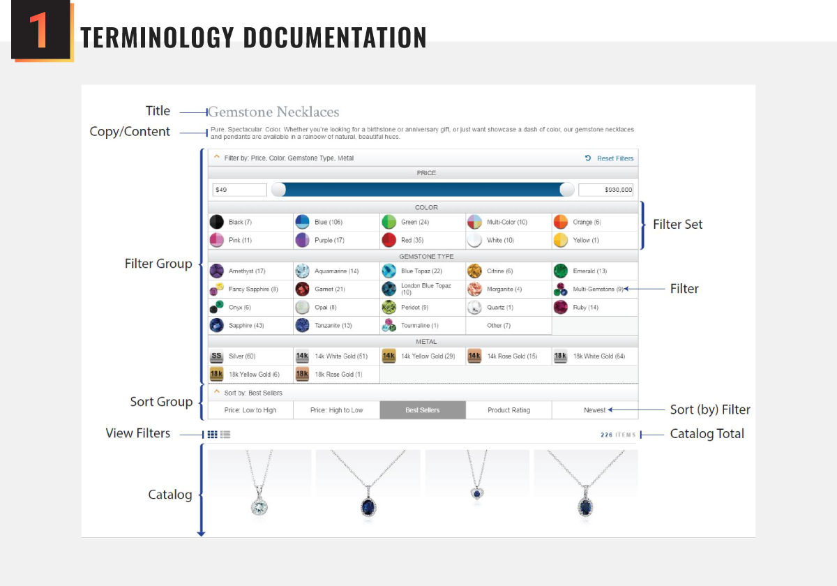
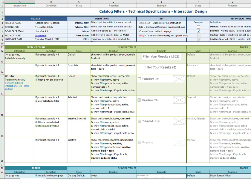
I quickly realized that we needed a common language for this project to promote accurate communication between departments and stakeholders. To that end, I created and distributed a visual aid defining each element and it's functionality.
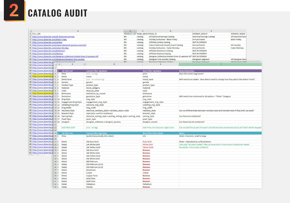
While creating a master list of every filter set, name, and icon for more than 350 catalog pages, I discovered multiple redundant catalog pages, missing filter sets, filter-count errors, and use-case errors—all of which needed to be addressed.
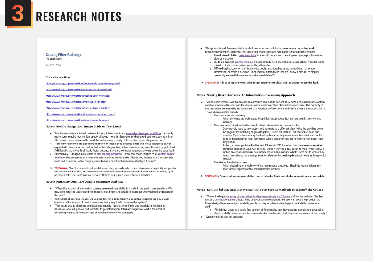
I performed a deep dive into recommendations provided by industry experts, including the Nielsen Norman Group, The Baymard Institute, and others. I took copious notes and provided a summary of my findings to stakeholders.
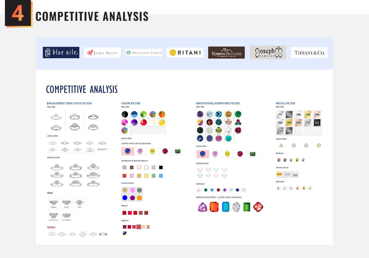
I performed a competitive analysis to understand how competitors were filtering their products. I also researched other e-commerce companies to find inspiration from designs that were meeting user's needs in innovative and delightful ways.
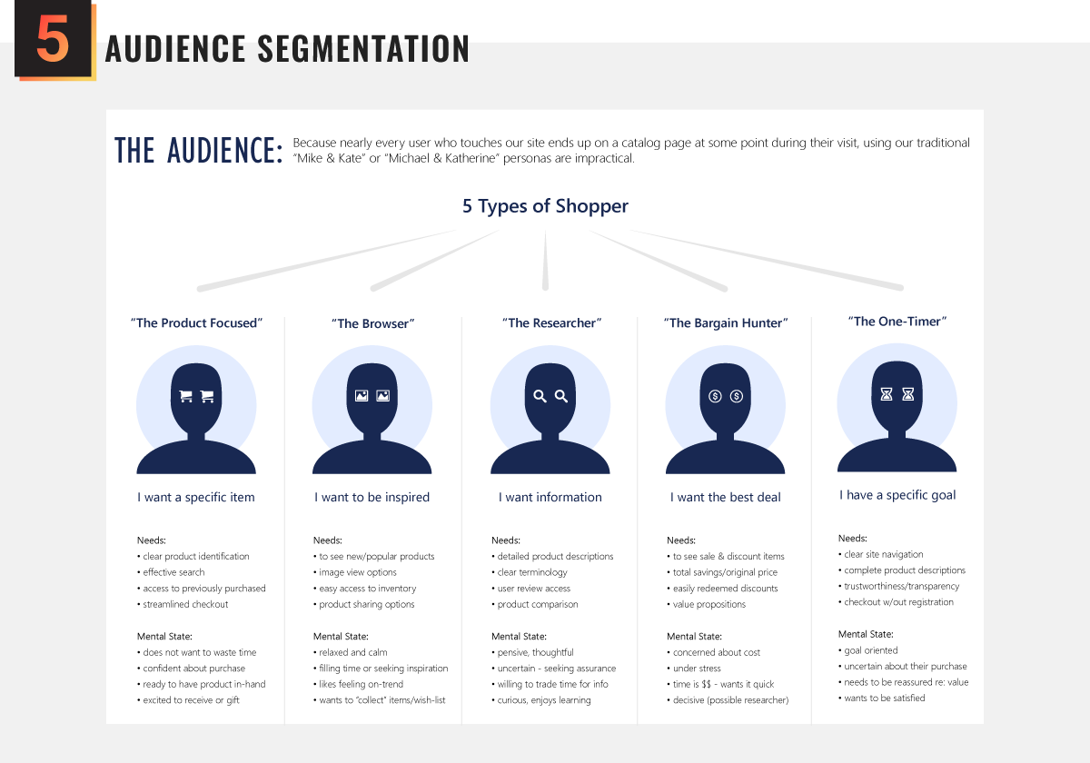
Catalog pages are interacted with by nearly every customer, which meant our traditional user personas were insufficient. So instead, we segmented our audience into 5 types of shoppers to better predict their behavior and needs.
Applying what we learned
Using easily recognized design patterns, intuitive functionality, visual cues, and a refined aesthetic, we created a filter system designed to aid discoverability and minimize cognative load.
Ideation & design concepts
› Wireframing allowed us to focus on interaction
› Wireframing allowed us to focus on interaction
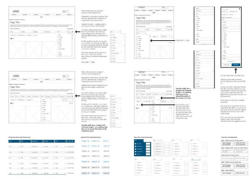
After a brief whiteboard brainstorming session for initial filter design concepts – inspired by our research – I began wireframing for all three device types (desktop, tablet, and mobile) and began exploring the application of brand style colors and patterns to the base wireframe models.
We completed a deep dive on menu placement, dropdown models, filter menus, sort functionality, applied filter notification, product count, filter count, and even type-area length to accommodate localization (language translation.)
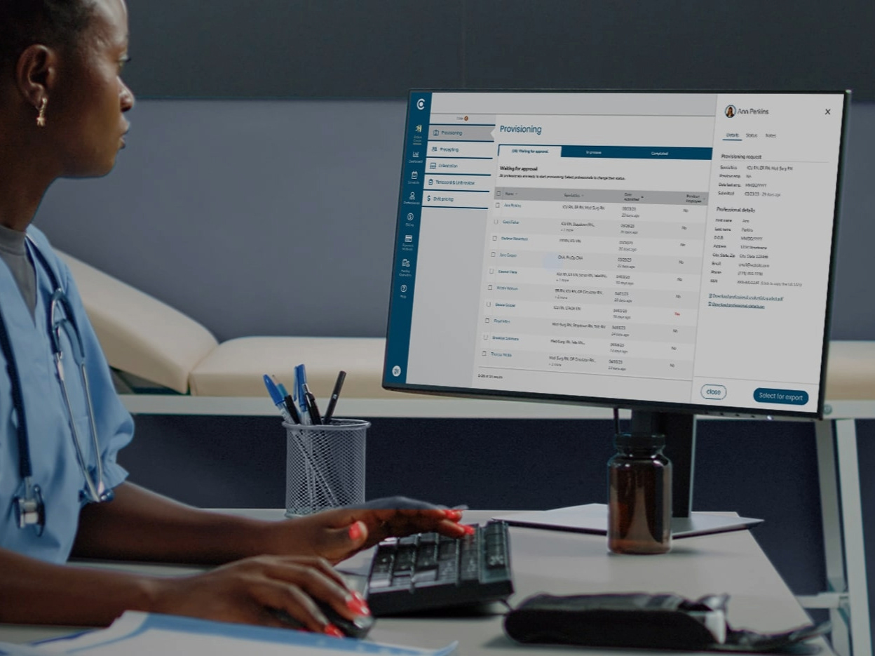
Hi-fis & Interactive Prototypes
› A hi-fi prototype revealed significant impact
› A hi-fi prototype revealed significant impact
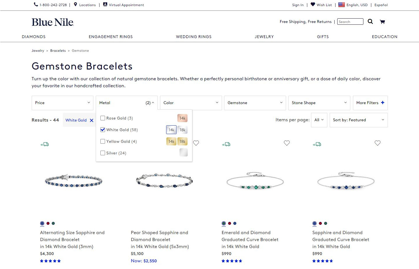
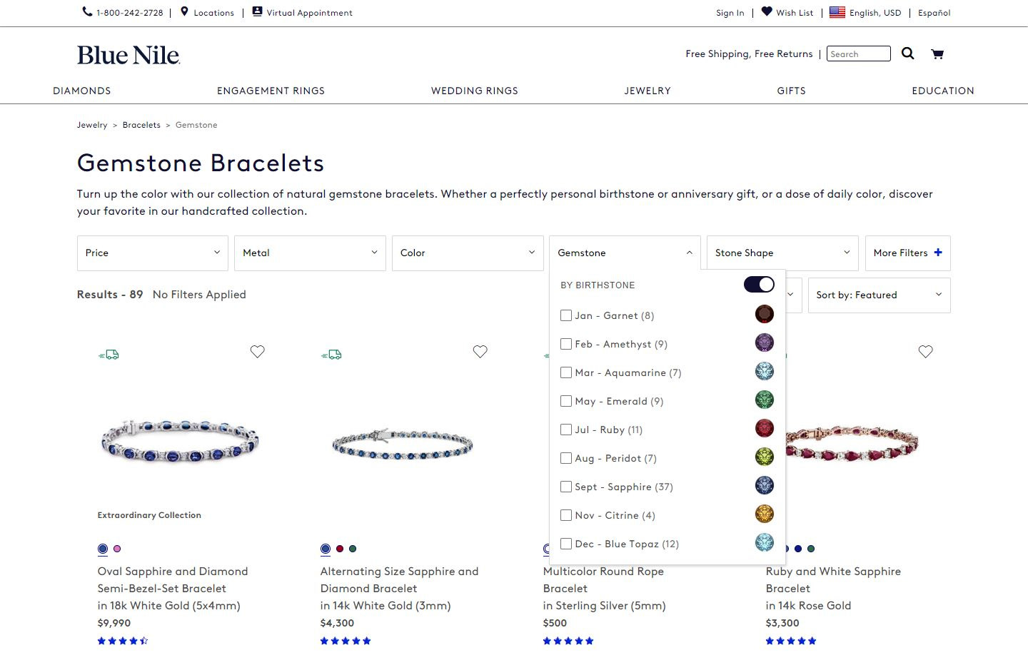
Given the simplicity of the design and the speed with which a high fidelity prototype could be assembled, we opted for a hi-fi prototype for testing purposes. I used a combination of Adobe and Axure software to model user interaction with the two most commonly used filters—metals and gemstones.
Stakeholders who reviewed the prototype quickly realized the advantages of both the new functionality and the newly refined design aesthetic, which they wanted to expand throughout the rest of the website.
Giving our users a voice
Open and Closed Card Sort Testing uncovered a need to further update filter labels and visual cues, while A/B Usability Testing revealed a deeply positive response to the new look and feel.
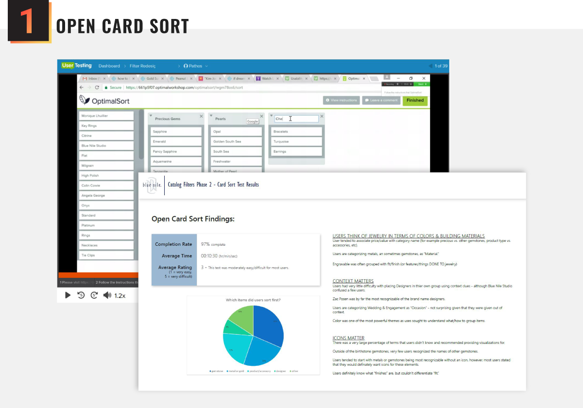
Using Optimal Workshop to perform Open Card Sort Testing helped us understand whether we had grouped our filters correctly and how users labeled those groups. Results revealed that some of our filter group names were too vague.
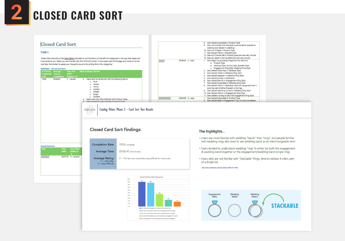
Next we perfomed Closed Card Sort Testing to help us understand how users fit content into a pre-existing structure, as well as revealing how users defined concepts with similar meanings, such as "ring" vs. "band."
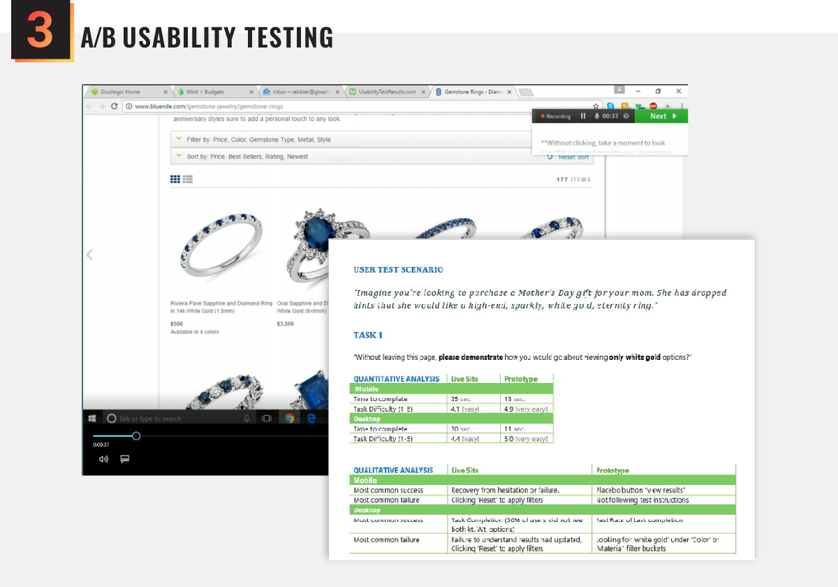
Once we had our filter names and sets sorted out, we updated our prototypes and began A/B Testing (on both desktop and mobile platforms) to analyze how our proposed changes would impact the user's success rate and brand impression. Testing the original filters against the new filters resulted in an overwhelmingly positive response—especially on mobile devices.
Implementing the final concept
While the visual design was relatively simple, the sheer number of moving parts, multiplied by the complexities of the filtering algorithms, was a challenge for the engineering team.
development & rollout
› Filter algorithms had to be outlined to spec
› Filter algorithms had to be outlined to spec
Our overhaul of the product filter functionality required significant changes to the algorithms used to populate the filter & sort menus and product results. I felt it was important to make sure the developers and quality assurance team had a point of reference.
To this end, I created a cheat sheet with use cases and visual examples for every if/else pathway the user may take. I also provided a list of icon use-cases to help developers identify filters requiring additional imagery.
The final product
The final product was a sleek, refined experience that allowed users to quickly discover products, narrow their options, and add their bling to their shopping bag with confidence.
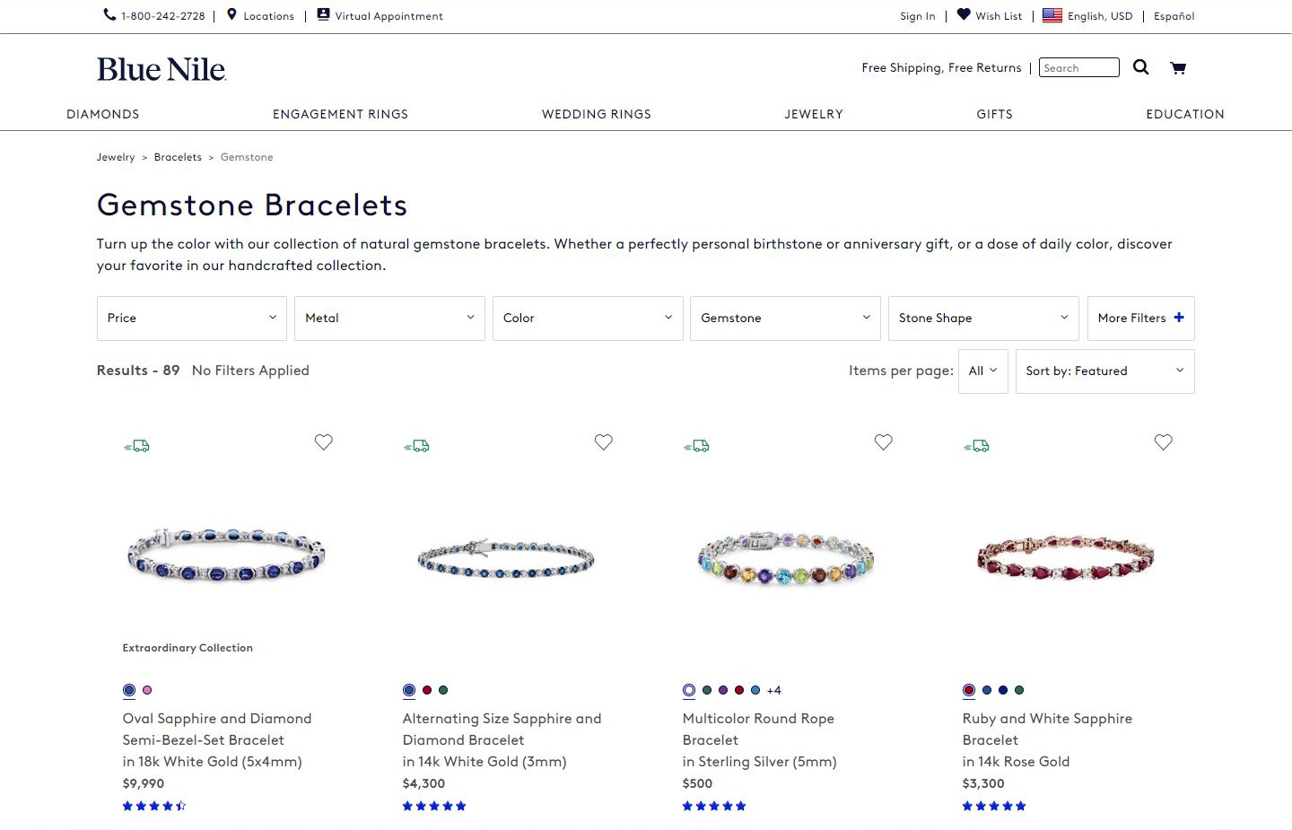
The updated filter system, once implemented across the remaining catalog pages, went live without any fanfare. However, the intuitive interface, the clean aesthetic, and the thoughtful application of interaction and visual cues, set the tone for a number of changes that would follow, including the overhaul of Blue Nile's entire website main menu.
After three months of monitoring Google Analytics we saw a 25% decrease in bounce rate and an 80% decrease in user-error rates across catalog pages. We also saw an increase in items added to the cart. While there were too many factors in determining sales impact from our changes, sales did continue to grow company-wide.
But perhaps what I'm most proud of, is that the catalog filter system I designed remained in place for more than six years before a later design team changed it. It's so rare that our digital products withstand the test of time—it's nice to have been given the freedom and resources to create something with such longevity.
Key Learnings
When given carte blanche on a project, dig deep, make no assumptions, and let the user lead you to build the best possible product—because quality stands the test of time.